TL;DR: The best church websites balance clarity for first-time visitors with depth for existing members. They answer essential questions (When? Where? What about kids?) in under 30 seconds while providing robust resources for sermons, events, and discipleship. This guide showcases 12 real church website examples across different styles—from minimalist to bold, traditional to contemporary—and breaks down exactly what makes each one effective. Whether your church has 50 members or 5,000, these proven design principles will help you create a website that welcomes guests and serves your congregation.
Table of Contents
- What Makes a Church Website "Work"?
- 12 Best Church Website Examples (Organized by Style)
- 7 Essential Elements Every Great Church Website Has
- Common Church Website Mistakes to Avoid
- How to Choose the Right Style for Your Church
- Frequently Asked Questions
What Makes a Church Website "Work"?
Your church website is often the first visit before the first visit. Someone searches "church near me" on their phone, lands on your site, and quietly asks: "Would I belong here?" The best church websites answer that question in 30 seconds or less.
Research shows that first impressions form in just 50 milliseconds—faster than you can blink. In that split second, visitors decide whether your website (and by extension, your church) feels welcoming, trustworthy, and worth exploring further. The stakes are high: if your site doesn't immediately communicate clarity and warmth, potential visitors will hit the back button and try the next church on the list.
Great church websites solve a unique challenge that most organizations don't face: serving two completely different audiences simultaneously. First-time visitors need instant answers to basic questions—when do you meet, where are you located, what happens with my kids? They're nervous, skeptical, and looking for reasons to either visit or move on. Meanwhile, existing members need depth—sermon archives, event calendars, small group signups, online giving, and ministry resources.
The "30-second test" is the gold standard for church website effectiveness. Can a first-time visitor, landing on your homepage with zero context, find service times, location, and kids' ministry information in under 30 seconds? If not, you're losing guests before they ever walk through your doors. According to a study by the Pew Research Center, 70% of church website traffic comes from mobile devices, which means visitors are often searching while sitting in their car, deciding whether to attend your service in the next hour.
But clarity alone isn't enough. Your website also needs to inspire. The best church websites balance information with emotion—they communicate your mission, values, and personality through design, copy, and imagery. They show real people from your congregation, not stock photos. They use language that welcomes outsiders, not insider church jargon. They make it easy to take the next step, whether that's watching a sermon online, signing up for a newcomer event, or simply showing up on Sunday.
Want a professional church website without the complexity? Fast Church Websites delivers done-for-you websites in 48 hours, starting at $97. Choose from 14 professional styles, all optimized for mobile and designed to convert visitors into attenders.
12 Best Church Website Examples (Organized by Style)
Not all churches are the same, and not all church websites should look the same. The best design for your church depends on your personality, audience, and resources. To help you find inspiration that actually fits your context, we've organized these examples into four distinct style categories. Each example includes what makes it effective and which types of churches it works best for.

Modern Minimalist Examples
Modern minimalist church websites embrace simplicity without sacrificing clarity. These designs use generous white space, clean typography, and restrained color palettes to create a timeless, professional aesthetic. The minimalist approach works particularly well for churches that want to communicate sophistication and focus attention on content rather than decoration.
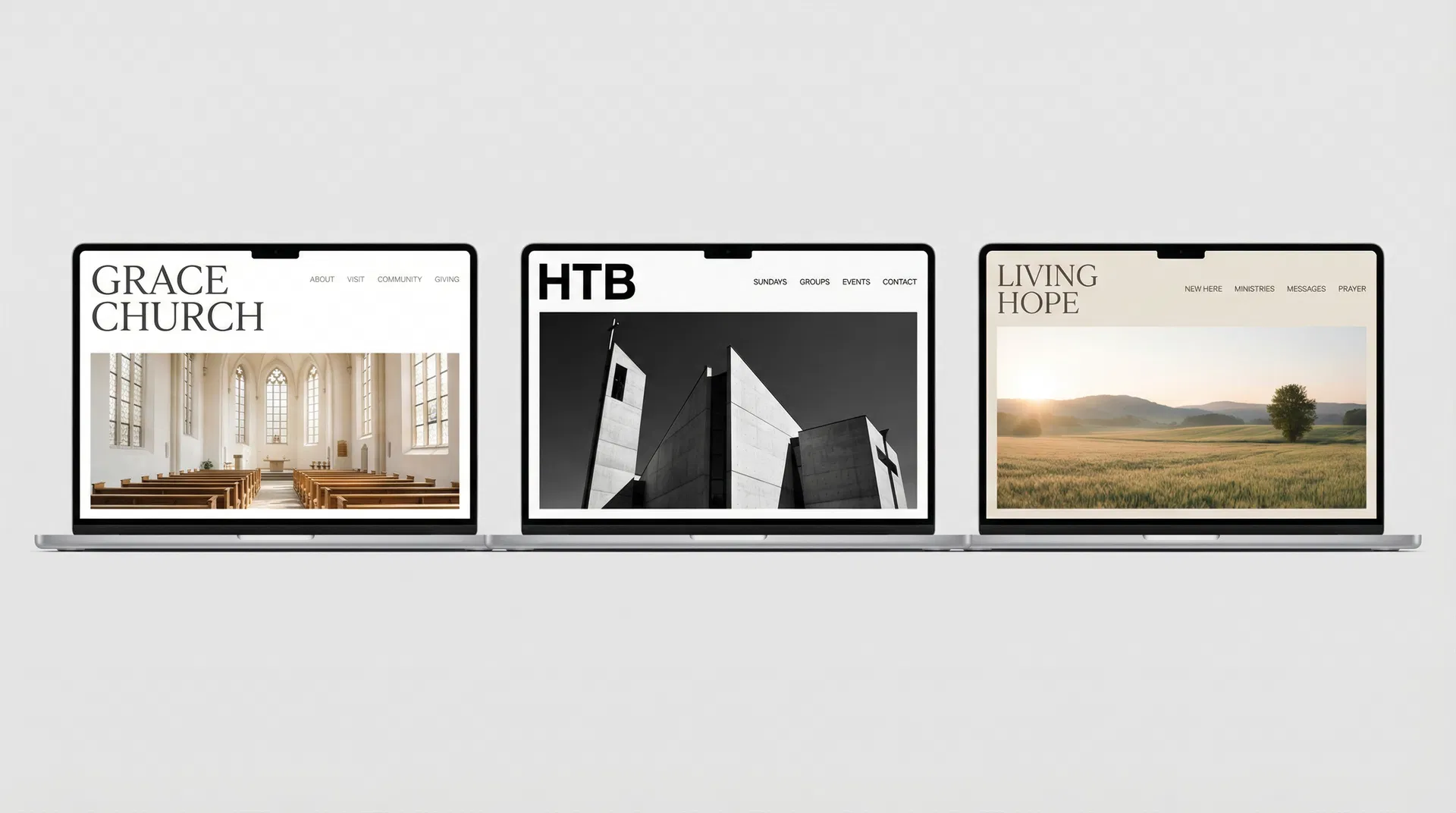
1. Grace Church
Grace Church's website exemplifies minimalist design done right. The homepage features a large, high-quality hero image of their sanctuary bathed in natural light, paired with a simple serif headline and a single clear call-to-action. Navigation is stripped down to five essential links, making it impossible to get lost. The color palette is almost entirely white and gray, with black text and a single accent color for buttons.
What makes it work: The minimalist approach forces clarity. There's nowhere to hide confusing information or bury important details. Service times are prominently displayed in the header. The "New Here" link is immediately visible. Kids' ministry information is just one click away. The design communicates that this church values simplicity, authenticity, and substance over flash.
Best for: Churches wanting a timeless, professional look that won't feel dated in five years. Particularly effective for urban churches with contemporary worship styles or churches undergoing a rebrand and wanting to signal a fresh start.
2. Knox Toronto
Knox Toronto takes a typography-first approach to minimalism. The homepage is dominated by large, bold headlines in a modern sans-serif font, with generous line spacing that makes content easy to scan. Images are used sparingly but strategically—each one serves a clear purpose rather than just filling space. The navigation hierarchy is crystal clear, with primary actions (Watch Online, Plan Your Visit) given visual priority over secondary content.
What makes it work: Strong typography creates visual hierarchy without needing decorative elements. Visitors immediately understand what's most important because the design literally makes it bigger and bolder. The generous spacing between sections gives the eye room to rest, reducing cognitive load and making the site feel calm rather than overwhelming.
Best for: Urban churches with contemporary worship styles, churches with strong preaching/teaching ministries, or churches whose primary audience is young professionals who appreciate clean, modern design.
3. HTB (Holy Trinity Brompton)
HTB's website uses a sophisticated black-and-white color scheme with high-quality architectural and people photography. The design feels more like a high-end magazine than a typical church website. Navigation is intuitive, with clear calls-to-action that stand out against the monochrome background. The site successfully balances elegance with accessibility—it looks premium but doesn't sacrifice usability.
What makes it work: The black-and-white color scheme creates instant sophistication and ensures the site will never look dated. High-quality photography shows real people and spaces, building trust and connection. The minimalist approach lets the content shine—when HTB has something important to say, there's nothing competing for attention.
Best for: Established churches wanting a modern refresh, churches in historic buildings that want to honor tradition while feeling contemporary, or churches whose congregation skews educated and professional.
Bold & Contemporary Examples
Bold contemporary church websites embrace vibrant colors, dynamic layouts, and strong branding. These designs prioritize visual storytelling and emotional connection, often featuring video backgrounds, custom graphics, and energetic typography. This style works best for churches with strong brand identities and the resources to maintain visually rich content.
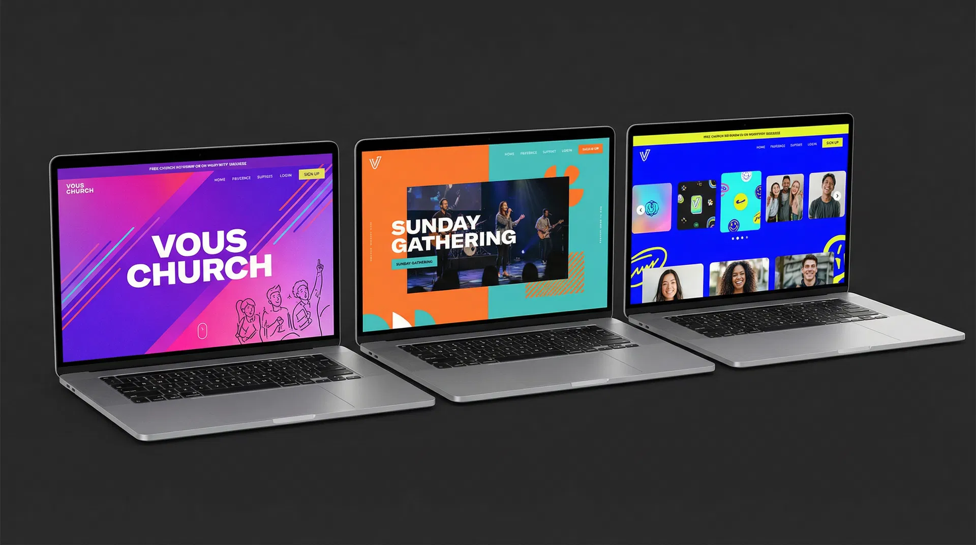
4. VOUS Church
VOUS Church's website is unmistakably bold. The homepage features vibrant purple and pink gradients, energetic diagonal layouts, and custom illustrations that reflect the church's Miami roots. The typography is large and unapologetic, with headlines that command attention. Every element of the design reinforces the church's brand identity—young, energetic, and unafraid to stand out.
What makes it work: The bold branding creates instant recognition and emotional connection. Visitors immediately understand this church's personality—it's not trying to be all things to all people. The vibrant colors and dynamic layouts mirror the energy of the worship experience, setting accurate expectations for first-time visitors. Custom graphics (rather than stock photos) make the site feel authentic and intentional.
Best for: Young, growing churches with strong brand identities, churches in creative or culturally diverse communities, or churches whose primary audience is millennials and Gen Z who appreciate bold, authentic design.
5. Passion City Church
Passion City Church's website emphasizes visual storytelling through dynamic content. The homepage features a video background showing worship moments, community gatherings, and mission work. The color palette balances vibrant accents (orange, teal) with neutral tones, creating energy without overwhelming visitors. Content is organized in visually distinct sections that guide the eye naturally down the page.
What makes it work: Video backgrounds immediately communicate the church's worship style and community culture. Visitors can see what Sunday morning actually looks like before they attend. The balanced color palette creates visual interest without sacrificing readability. Dynamic content (recent sermons, upcoming events) keeps the site feeling alive and current rather than static.
Best for: Large churches with robust media production capabilities, churches with compelling visual stories to tell (mission work, community impact), or churches whose worship style is best communicated through video rather than text.
6. Elevation Church
Elevation Church's website tackles the challenge of comprehensive resources without overwhelming visitors. The homepage uses clear visual hierarchy to separate content for guests (service times, locations, what to expect) from content for members (sermon library, groups, giving). Multi-level navigation organizes dozens of pages into logical categories. The mobile app is prominently featured, creating a seamless experience across platforms.
What makes it work: Smart information architecture prevents overwhelm despite extensive content. First-time visitors see what they need immediately, while members can dive deeper with one click. The sermon library is robust and searchable, serving as a valuable resource beyond Sunday morning. Mobile app integration extends engagement beyond the website, creating multiple touchpoints throughout the week.
Best for: Multi-site churches with extensive programming, churches with large online audiences, or churches whose digital presence is a core part of their ministry strategy rather than just a marketing tool.
Traditional & Welcoming Examples
Traditional welcoming church websites use warm tones, pastoral language, and family-friendly imagery to create a sense of comfort and belonging. These designs prioritize clarity and accessibility over cutting-edge aesthetics, focusing on making nervous first-time visitors feel at ease. This style works particularly well for established churches with multi-generational congregations.
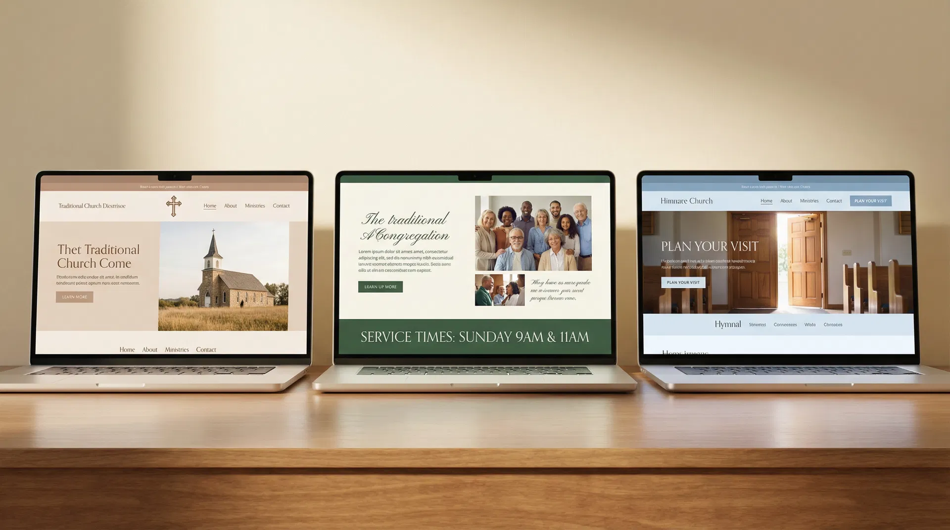
7. First Methodist Carlsbad
First Methodist Carlsbad's website feels like a personal invitation rather than a bulletin board. The "Plan Your Visit" section goes beyond basic logistics to actually pastor people through their first visit—explaining where to park, what to wear, how kids' environments work, and what the service style feels like. The tone is warm and anticipatory, like a friend preparing you for a party at their house.
What makes it work: The pastoral tone lowers anxiety for nervous visitors. Instead of just listing service times, the site walks people through what to expect, addressing unspoken questions like "Will I be singled out?" or "What if my kids act up?" Multiple service options are framed as helpful choices rather than confusing alternatives. The events calendar feels alive and current, signaling an active community rather than a static institution.
Best for: Traditional churches wanting to lower barriers for first-timers, churches in communities with many unchurched residents, or churches whose primary value is genuine hospitality and pastoral care.
8. Holy Trinity Edmond
Holy Trinity Edmond's website weaves their mission—"Love God, Love One Another, Love Neighbor"—into the site structure itself. These three phrases aren't buried on an "About" page; they shape the main navigation and content organization. Sunday morning details are spelled out with enough specificity to calm nerves (service times, worship style, what a typical Sunday looks like). Family-friendly clarity extends to kids' and student ministry pages, which address safety, age-appropriate discipleship, and where to go on Sunday.
What makes it work: Letting theological and missional convictions shape site structure (not just content) creates coherence and authenticity. Visitors understand not just what this church does, but why they do it. Detailed Sunday morning information addresses the practical questions that keep people from visiting. Family-friendly clarity signals that this church takes children's ministry seriously, which is often a deciding factor for young families.
Best for: Churches with strong theological identities, churches whose mission statement actually drives decision-making (not just marketing), or churches wanting to attract families with young children.
9. First Baptist Durango
First Baptist Durango's website serves both guests and members equally well. The homepage features immediate CTAs for "NEW HERE?", "Who We Are", "SERMONS", and "Events"—covering the needs of both audiences. The "About" page explains their framework (Gospel, Community, Word, Mission) in language that's both accessible and doctrinally grounded. A digital bulletin links Sunday to weekday life, while robust resources (sermons, gospel communities, membership information, benevolence details) make the site genuinely useful beyond Sunday morning. Leadership bios include personal testimonies, giving newcomers a sense of who's leading and how God has worked in their lives.
What makes it work: Dual-audience design means neither guests nor members feel like an afterthought. Clear theological framework helps visitors understand what this church believes and why it matters. Digital bulletin and robust resources turn the website into a hub for congregational life, not just a marketing tool. Leadership transparency builds trust—visitors can see real people with real stories, not just titles and credentials.
Best for: Baptist or Reformed churches wanting doctrinal clarity, churches with strong teaching ministries, or churches whose members actively use the website for discipleship resources beyond just checking service times.
Community-Focused Examples
Community-focused church websites prioritize people over programs, connection over information, and relationships over resources. These designs feature authentic photography of real congregation members, clear pathways from visitor to member, and prominent small group or connection opportunities. This style works best for churches whose primary value is genuine community and relational discipleship.
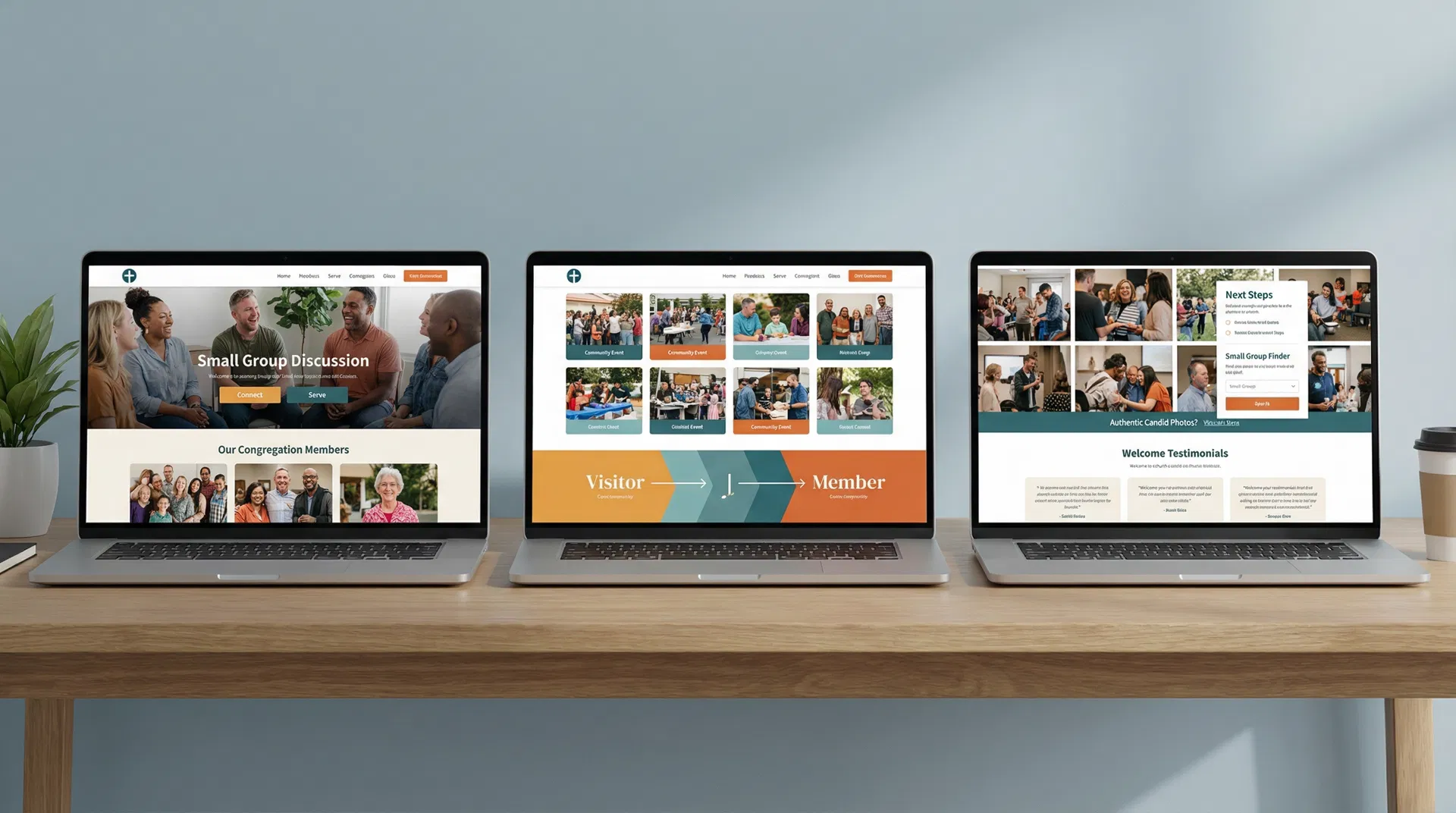
10. Live Oak Community Church
Live Oak Community Church's website is built around one simple idea: help people take their next step. The homepage doesn't just list ministries—it shows clear pathways from visitor to attender to member to leader. Age-specific ministry pages lower anxiety by showing exactly what to expect, where to go, and how to get involved. The connected ecosystem ties sermons, events, giving, and the mobile app together so people can engage from anywhere, not just Sunday morning.
What makes it work: Next-step clarity removes friction from the journey. Visitors don't have to guess what to do next—the site tells them. Age-specific ministry pages address the #1 barrier for families: "What happens with my kids?" The connected ecosystem meets people where they are, whether that's watching a sermon at home, signing up for a group online, or giving from their phone.
Best for: Growing churches focused on discipleship pathways, churches with strong small group cultures, or churches whose strategy centers on moving people from the crowd to the core.
11. The Way LBK
The Way LBK's website treats the digital experience like your physical lobby—it shows what it will feel like to be there. The "What to Expect" content mentions specific details: greeters, coffee and donuts in the Holy Grounds Café, modern worship, and a promise of no awkward "stand up and introduce yourself" moments. Simple, repeated Sunday clarity ("Discussion 9:30am | Worship 10:30am" and "LIVE STREAM – 10:30") makes it easy for both in-person and online attenders. Real discipleship pathways for kids, youth, adults, and missions each have clear next steps. The mobile app is featured as a way to stay connected, listen to sermons, manage signups, and give.
What makes it work: Specific details build trust and lower anxiety. Generic promises ("We're friendly!") don't reassure nervous visitors, but specific details ("We have coffee and donuts in the Holy Grounds Café") do. The no-awkward-introductions promise addresses a common fear. Simple Sunday clarity removes confusion about when to show up and what to expect. Mobile app integration extends community beyond Sunday.
Best for: Community churches wanting an authentic, warm feel, churches whose hospitality is a genuine strength (not just a marketing claim), or churches in smaller towns where personal connection is the primary draw.
12. Engage Church
Engage Church's website leads with a plainspoken, honest welcome: "No matter where you are, or where you've been, you can ENGAGE here." The "What to Expect" section answers actual questions about service length, style, and feel in normal, everyday language. Visible heart for diverse communities (Spanish-language ministry, multicultural awareness) signals who they're intentionally trying to reach. Clear next steps beyond Sunday (groups, serving, connection points) are action-oriented and accessible.
What makes it work: Honest welcome for people with messy stories removes the "Do I have to clean up my life before I come?" barrier. Plainspoken language avoids church jargon that alienates outsiders. Visible commitment to diversity signals intentionality—this isn't accidental, it's core to who they are. Action-oriented next steps make it easy to move from visitor to participant.
Best for: Churches intentionally reaching diverse or unchurched communities, churches in urban or culturally diverse areas, or churches whose mission specifically includes welcoming people who don't fit the "typical church" mold.
Inspired by these examples but don't know where to start? Fast Church Websites includes all these essential elements in every design. Choose from 14 professional styles (minimalist, bold, traditional, community-focused), delivered in 48 hours. No design skills required.
7 Essential Elements Every Great Church Website Has
Regardless of style, every effective church website includes seven non-negotiable elements. These aren't optional features or nice-to-haves—they're the foundation that makes everything else work. If your website is missing any of these, you're losing visitors before they ever walk through your doors.
| Element | Why It Matters | Where to Place It |
|---|---|---|
| 1. Service Times & Location | First question every visitor has. If they can't find this in 10 seconds, they'll try another church. | Header, footer, AND hero section. Redundancy is your friend. |
| 2. "New Here" or "Plan Your Visit" Page | Lowers anxiety for first-timers by answering unspoken questions: What do I wear? Where do I park? Will I be singled out? | Main navigation (top 3 links) and prominent CTA on homepage. |
| 3. Kids & Youth Ministry Info | Parents won't visit without knowing their kids will be safe and engaged. This is often the deciding factor. | Main navigation and featured on homepage. Include ages, safety protocols, and what a typical Sunday looks like. |
| 4. Sermon Library or Resources | Keeps members engaged during the week and allows visitors to "try before they buy" by watching a sermon online. | Main navigation or homepage feature. Make it searchable and easy to filter by date, series, or topic. |
| 5. Clear Next Steps (Groups, Serving) | Moves people from attendance to involvement. Churches grow through small groups and serving, not just Sunday services. | Homepage CTAs and dedicated pages. Show pathways, not just lists of options. |
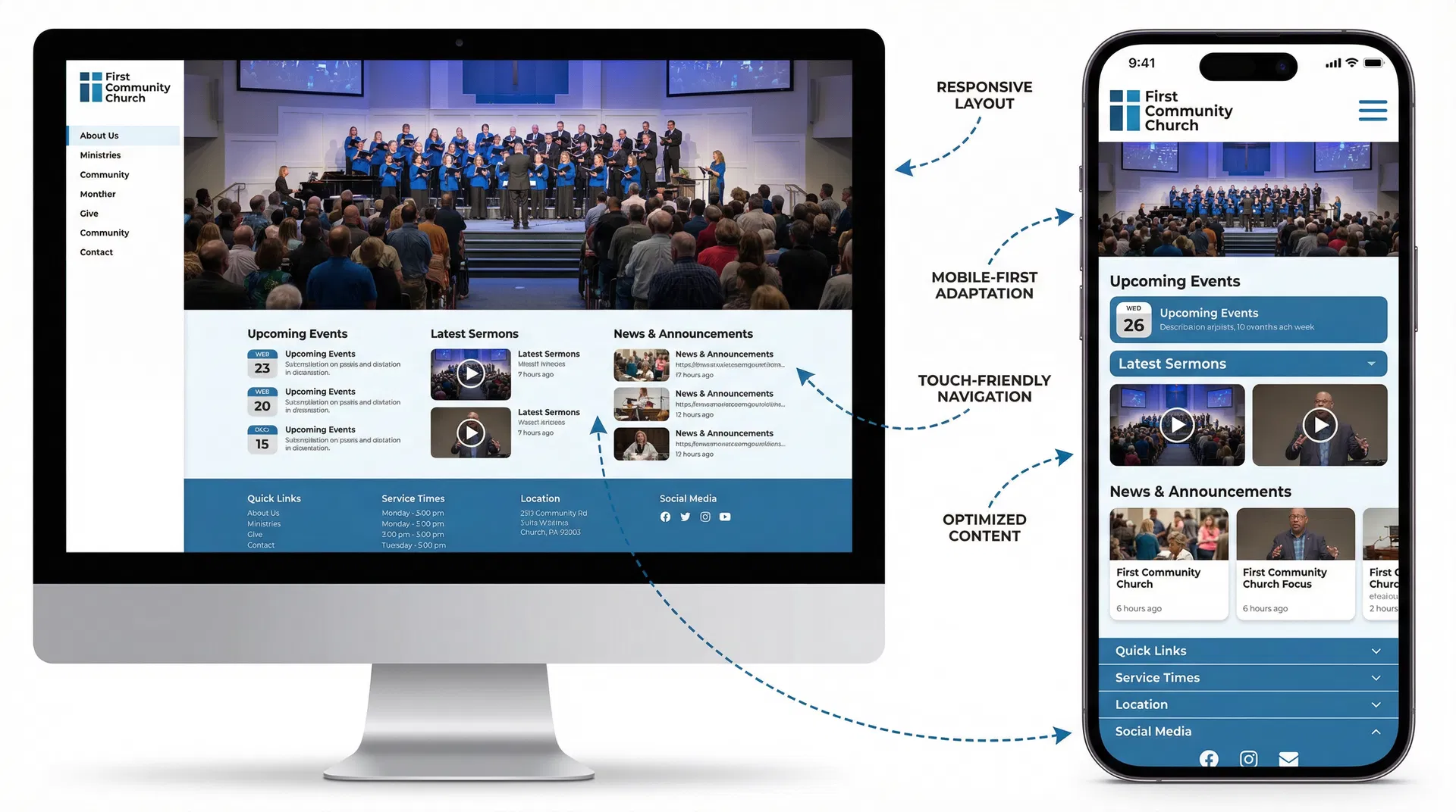
| 6. Mobile-Responsive Design | 70% of church website traffic is mobile. If your site doesn't work on phones, you're invisible to most visitors. | Built into design from the start. Test on real devices, not just desktop browser resizing. |
| 7. Fast Load Times | Slow sites lose 53% of mobile visitors. Google also penalizes slow sites in search rankings. | Technical foundation: compress images, use modern formats (WebP), minimize code, use a CDN. |
Let's expand on each of these elements to understand not just what they are, but how to do them right.
Service Times & Location: This seems obvious, but you'd be surprised how many church websites bury this information or assume everyone already knows it. Put service times in your header (visible on every page), your footer (backup for people who scroll), and prominently on your homepage hero section. Include the full address with a Google Maps embed, not just "123 Main St"—people need one-click directions. If you have multiple services or locations, make the differences clear. Don't make visitors hunt for this information.
"New Here" or "Plan Your Visit" Page: This page should read like a friend preparing you for a party at their house. Answer the questions people are too embarrassed to ask: What should I wear? (Casual, dressy, somewhere in between?) Where should I park? (Is there a visitor lot? Street parking?) What happens when I walk in? (Will someone greet me? Where do I go?) What about my kids? (Where's the check-in? What's the security protocol?) Will I be singled out? (No awkward introductions, we promise.) How long is the service? (60 minutes, 90 minutes?) What's the worship style? (Contemporary, traditional, blended?) The more specific you are, the more anxiety you remove.
Kids & Youth Ministry Info: Parents will not visit your church if they don't trust you with their kids. Period. Your kids' ministry page needs to communicate safety, engagement, and age-appropriateness. Include specific ages for each environment (nursery 0-2, preschool 3-5, elementary K-5, etc.). Explain your check-in and security protocols. Show what a typical Sunday looks like for kids (worship, lesson, small group, games). Include photos of real kids from your church (with parent permission), not stock photos. If possible, introduce your kids' ministry leaders by name and photo. The goal is to make parents feel confident that their kids will be safe, engaged, and spiritually nurtured.
Sermon Library or Resources: Your sermon library serves two audiences: members who want to revisit a message or catch up after missing a Sunday, and visitors who want to "try before they buy" by watching online before attending in person. Make your sermon library searchable and filterable by date, series, topic, or speaker. Include video if possible (people connect with faces), but audio-only is better than nothing. Add sermon notes or discussion questions to extend engagement beyond passive listening. Consider featuring your most popular or recent series on the homepage to give visitors a starting point.
Clear Next Steps: The journey from visitor to member to leader should be obvious, not mysterious. Don't just list ministries—show pathways. For example: "New here? Start with a Sunday service. Ready for more? Join a small group. Want to serve? Explore volunteer opportunities." Use visual pathways (arrows, numbered steps, progress indicators) to make the journey tangible. Make it easy to take action—every next step should have a clear CTA (button, form, link) that removes friction.
Mobile-Responsive Design: According to Pew Research, 70% of church website traffic comes from mobile devices. If your site doesn't work on phones, you're invisible to the majority of your potential visitors. Mobile-responsive design isn't just about shrinking your desktop site—it's about rethinking the experience for small screens. Navigation needs to be touch-friendly (large buttons, hamburger menus). Content needs to be scannable (short paragraphs, clear headings). Forms need to be simple (minimal fields, large input areas). Test your site on real devices, not just by resizing your desktop browser. Better yet, ask a few church members to test it and report any issues.
Fast Load Times: Google research shows that 53% of mobile visitors abandon sites that take longer than 3 seconds to load. Slow sites don't just frustrate visitors—they also rank lower in Google search results, making you harder to find in the first place. The biggest culprit is usually images. Compress all images before uploading (tools like TinyPNG or ImageOptim can reduce file sizes by 70% without visible quality loss). Use modern image formats like WebP instead of JPEG or PNG. Minimize unnecessary code and plugins. Use a content delivery network (CDN) to serve files faster. If you're not technical, use a website builder that handles this automatically (like Fast Church Websites, which optimizes everything by default).
Common Church Website Mistakes to Avoid
Even well-intentioned churches make predictable mistakes that undermine their websites' effectiveness. Here are the most common pitfalls and how to avoid them.
Mistake #1: Using insider language. Terms like "narthex," "fellowship hall," "Sunday School," and "small groups" might be clear to lifelong churchgoers, but they're confusing to unchurched visitors. Use plain language that anyone can understand. Instead of "narthex," say "lobby." Instead of "fellowship hall," say "community room." Instead of "small groups," say "discussion groups" or "connection groups."
Mistake #2: Burying service times. If a visitor has to click more than once to find when and where you meet, you've already lost them. Service times should be visible on every page—in the header, footer, and prominently on the homepage. Don't make people hunt for this basic information.
Mistake #3: Stock photos instead of real people. Generic stock photos of diverse people holding Bibles or praying with their eyes closed don't build trust—they signal inauthenticity. Use real photos of your actual congregation, even if they're not professionally shot. Authenticity beats polish every time.
Mistake #4: Overwhelming visitors with too many options. When everything is important, nothing is important. Don't try to feature every ministry, event, and resource on your homepage. Prioritize ruthlessly. What do first-time visitors need to know? What do existing members use most? Focus on those things and let everything else live one click deeper.
Mistake #5: Neglecting mobile users. Testing your site by resizing your desktop browser isn't enough. Real mobile users interact differently—they tap instead of click, they scroll with their thumbs, they're often multitasking or in a hurry. Test your site on actual phones and tablets. Better yet, ask church members to test it and report any issues.
Mistake #6: Letting content go stale. Nothing signals "dead church" faster than outdated content. If your homepage still promotes last year's Easter service or your events calendar hasn't been updated in months, visitors will assume your church is equally neglected. Assign someone to update the site weekly—even if it's just refreshing the homepage with current events or the latest sermon.
Mistake #7: No clear call-to-action. Every page should answer the question: "What should I do next?" If visitors land on your homepage and don't know whether to watch a sermon, plan a visit, or sign up for something, they'll do nothing. Use clear, prominent CTAs that guide people to the next logical step.
How to Choose the Right Style for Your Church
The best church website style isn't the one that looks coolest—it's the one that authentically reflects your church's personality and serves your specific audience. Here's how to choose wisely.
Start with your worship style. Your website should set accurate expectations for what Sunday morning feels like. If your worship is contemporary with a live band, vibrant colors and dynamic layouts make sense. If your worship is traditional with hymns and liturgy, a more classic design with warm tones and serif fonts fits better. The goal isn't to trick people into visiting—it's to attract people who will actually fit.
Consider your congregation's demographics. Who are you trying to reach? Young families need clear kids' ministry information and mobile-friendly design. Retirees might prefer larger text and simpler navigation. Urban professionals might appreciate minimalist design and online giving. Multi-generational churches need to balance these needs, which often means choosing a middle-ground style that doesn't alienate anyone.
Be honest about your resources. Bold, contemporary websites with video backgrounds and custom graphics require ongoing maintenance and content creation. If you don't have a dedicated communications team or the budget for professional photography, choose a simpler style that you can actually maintain. A simple, well-maintained website beats a fancy, outdated one every time.
Look at churches similar to yours. Find 3-5 churches that are similar in size, location, and style to yours. What do their websites look like? What works well? What doesn't? You're not copying—you're learning from churches that have already solved similar problems.
Test with real people. Before launching a new design, show it to 5-10 people who represent your target audience. Ask them: What's your first impression? Can you find service times in 10 seconds? Does this feel like a church you'd want to visit? Their feedback will reveal blind spots you'd never catch on your own.
| Church Type | Recommended Style | Why It Works |
|---|---|---|
| Small rural church (50-150 members) | Traditional & Welcoming | Warm, pastoral tone lowers anxiety. Simple design is easy to maintain with limited resources. |
| Urban contemporary church (200-500 members) | Modern Minimalist | Clean, professional aesthetic appeals to young professionals. Timeless design won't feel dated quickly. |
| Large multi-site church (1,000+ members) | Bold & Contemporary | Dynamic design reflects energy and scale. Robust resources serve large, diverse congregation. |
| Church plant or restart (any size) | Bold & Contemporary | Fresh, energetic design signals new beginning. Strong branding helps establish identity quickly. |
| Family-focused suburban church (300-800 members) | Community-Focused | People-first design appeals to families. Clear pathways help visitors connect quickly. |
| Historic or traditional church (any size) | Traditional & Welcoming | Classic design honors heritage while remaining accessible. Pastoral tone reflects values. |
Ready to build your church website? Fast Church Websites offers 14 professional styles across all categories—minimalist, bold, traditional, and community-focused. Every design includes all 7 essential elements, mobile optimization, and fast load times. Delivered in 48 hours, starting at $97.
Frequently Asked Questions
What makes a church website effective?
An effective church website passes the "30-second test"—first-time visitors can find service times, location, and kids' ministry information in under 30 seconds. It balances clarity for guests with depth for members, uses authentic imagery instead of stock photos, and includes clear calls-to-action that guide visitors to the next step. Mobile responsiveness and fast load times are non-negotiable, as 70% of church website traffic comes from mobile devices.
How much does a good church website cost?
Church website costs vary widely. DIY website builders (Wix, Squarespace) cost $15-30/month but require significant time investment and design skills. Freelance designers charge $1,500-5,000 for custom sites, with ongoing maintenance costs. Agencies charge $5,000-15,000+ for comprehensive solutions. Fast Church Websites offers a middle path: professionally designed websites starting at $97, delivered in 48 hours with no design skills required.
What pages should a church website have?
Every church website needs these core pages: Homepage (service times, welcome message, clear CTAs), About (mission, beliefs, leadership), Plan Your Visit (what to expect, parking, dress code), Ministries (kids, youth, adults, groups), Sermons or Resources, Events Calendar, Contact (location, map, contact form), and Give (online giving options). Larger churches may add Staff, Locations (for multi-site), Missions, and Member Resources.
Should my church website have online giving?
Yes. Online giving removes friction and increases generosity. According to Pushpay, churches with online giving see 32% higher giving per household. Make it prominent (header or footer link), simple (minimal clicks), and secure (SSL certificate, trusted payment processor). Offer recurring giving options—people who give monthly give 42% more annually than those who give weekly or sporadically.
How often should I update my church website?
Update your homepage weekly with current events, sermon series, or announcements. Update your events calendar as soon as new events are scheduled. Update your sermon library within 24 hours of each service. Review and refresh your core pages (About, Ministries, Contact) quarterly to ensure accuracy. Stale content signals a stale church—regular updates show your church is alive and active.
Do I need a church app or is a website enough?
Start with a great website first. A mobile-responsive website serves 90% of what a church app does—sermon access, event calendars, giving, contact information—without requiring users to download anything. Add an app later if you have specific needs like check-in systems, push notifications for urgent updates, or robust small group management. For most churches under 500 members, a great website is sufficient.
How do I make my church website rank higher in Google?
Start with the basics: claim your Google Business Profile, ensure your name, address, and phone number are consistent across all platforms, and get listed in local directories. On your website, use location-based keywords naturally ("First Baptist Church in Denver"), create valuable content (blog posts, sermon transcripts), optimize page titles and meta descriptions, and ensure fast load times. Build backlinks by getting listed on church directories, partnering with local organizations, and creating shareable content.
What's the biggest mistake churches make with their websites?
The biggest mistake is designing for existing members instead of first-time visitors. Churches assume everyone already knows when they meet, where they're located, and what to expect—so they bury this information or skip it entirely. In reality, most website visitors are strangers who need basic information before they'll consider visiting. Always prioritize the visitor experience first, then add depth for members.
Conclusion
The best church websites don't follow a single formula—they authentically reflect each church's unique personality while serving both first-time visitors and existing members effectively. Whether your church gravitates toward modern minimalism, bold contemporary design, traditional warmth, or community-focused connection, the principles remain the same: clarity, authenticity, mobile optimization, and clear next steps.
Your website is often the first impression someone has of your church. Make it count. Answer the basic questions quickly, communicate your personality honestly, and make it easy for visitors to take the next step—whether that's watching a sermon online, planning their first visit, or showing up on Sunday morning.
If you're ready to build or refresh your church website, Fast Church Websites offers 14 professional styles across all categories, delivered in 48 hours starting at $97. Every design includes all seven essential elements, mobile optimization, and the clarity your visitors need to say yes to that first visit.