15 Beautiful Church Website Examples (And What Makes Them Work)
Your church website is often the first visit before the first visit. People search "church near me," skim your site on their phone, and quietly ask, "Would I belong here?" This guide analyzes 15 real church websites that answer that question with both clarity and warmth.
Ready to Get Your Church Online?
Professional church websites built in 48 hours. No technical skills required. Starting at just $97.
15 Beautiful Church Website Examples (And What Makes Them Work)
TL;DR: Your church website is often the first visit before the first visit. People search "church near me," skim your site on their phone, and quietly ask, "Would I belong here?" This guide analyzes 15 real church websites that answer that question with both clarity (service times, location, kids' ministry) and warmth (pastoral copy, welcoming design, mission-driven structure). Learn the design principles, content strategies, and technical decisions that make these sites convert curious visitors into first-time guests. For more details, see our church website design best practices guide [blocked]. For more details, see our best church website builders for 2026 [blocked].
Introduction: Why Your Church Website Matters More Than Ever
When someone searches "church near me" on their phone while sitting in a coffee shop or driving through your neighborhood, your website has about 30 seconds to answer three critical questions: When do you meet? Where are you located? What happens with my kids? If they can't find these answers quickly, they'll hit the back button and try the next church on the list.
Your church website is no longer just a digital bulletin board. It's your lobby, your welcome desk, and your first impression all rolled into one. According to recent research, 82% of church visitors check your website before attending their first service. They're not just looking for service times—they're trying to figure out if they'll belong, if their kids will be safe, and if your church is the kind of place where someone with their story can find hope.
The best church websites balance two seemingly opposite goals: they provide instant clarity for nervous first-time visitors while also serving as a resource hub for existing members. They answer practical questions ("What should I wear?" "Where do I park?") while also communicating the heart of your mission. They're mobile-friendly, visually appealing, and—most importantly—they feel like a warm handshake instead of a corporate brochure.
In this guide, we'll analyze 15 real church websites that get this balance right. You'll see examples from mega-churches and small congregations, traditional denominations and contemporary movements, minimalist designs and bold visual storytelling. Each example includes specific lessons you can apply to your own church website, whether you're building from scratch or refreshing an existing site.
The 7 Principles of Effective Church Website Design
Before we dive into specific examples, let's establish the framework. Every great church website—regardless of size, denomination, or design style—follows these seven core principles:
1. The 30-Second Test
Can a first-time visitor answer "When do you meet? Where are you located? What about my kids?" in under 30 seconds? If not, your homepage needs work. Service times, location with map/directions, and a clear "New Here" or "Plan Your Visit" button should be visible without scrolling.
2. Clarity Over Cleverness
Your website copy should shepherd, not just inform. Write like you're talking to someone who's nervous about visiting church for the first time. Skip the insider language ("Join us for corporate worship at the main campus") and use plain English ("Sunday service at 10am—come as you are").
3. Mobile-First Design
Most church searches happen on phones while people are driving, researching, or sitting in a parking lot deciding whether to walk in. Your site must load fast, display clearly on small screens, and make it easy to tap a phone number or get directions with one click.
4. Warmth in Voice
The best church websites don't just list facts—they pastor people through the decision to visit. They address real anxieties: "What should I wear?" "Will I have to stand up and introduce myself?" "Is there childcare?" "What's the music like?" Answer these questions with warmth and specificity.
5. Mission-Driven Structure
Let your theological and missional center of gravity shape your site structure, not just your "About" page. If your church's mission is "Love God, Love People, Make Disciples," that framework should show up in your navigation, your homepage sections, and your content hierarchy.
6. Dual-Purpose Design
A strong church website serves both guests and members. New visitors need service times, location, and "What to Expect" content. Existing members need sermon archives, event calendars, small group signups, and giving platforms. The best sites organize these two audiences clearly without creating confusion.
7. Visual Storytelling
People want to see what your church actually looks like. Use high-quality photos of real people in your congregation—not stock images. Show worship moments, community gatherings, kids' ministry in action, and the diversity of your church family. Let visitors visualize themselves in your space before they ever walk through the door.
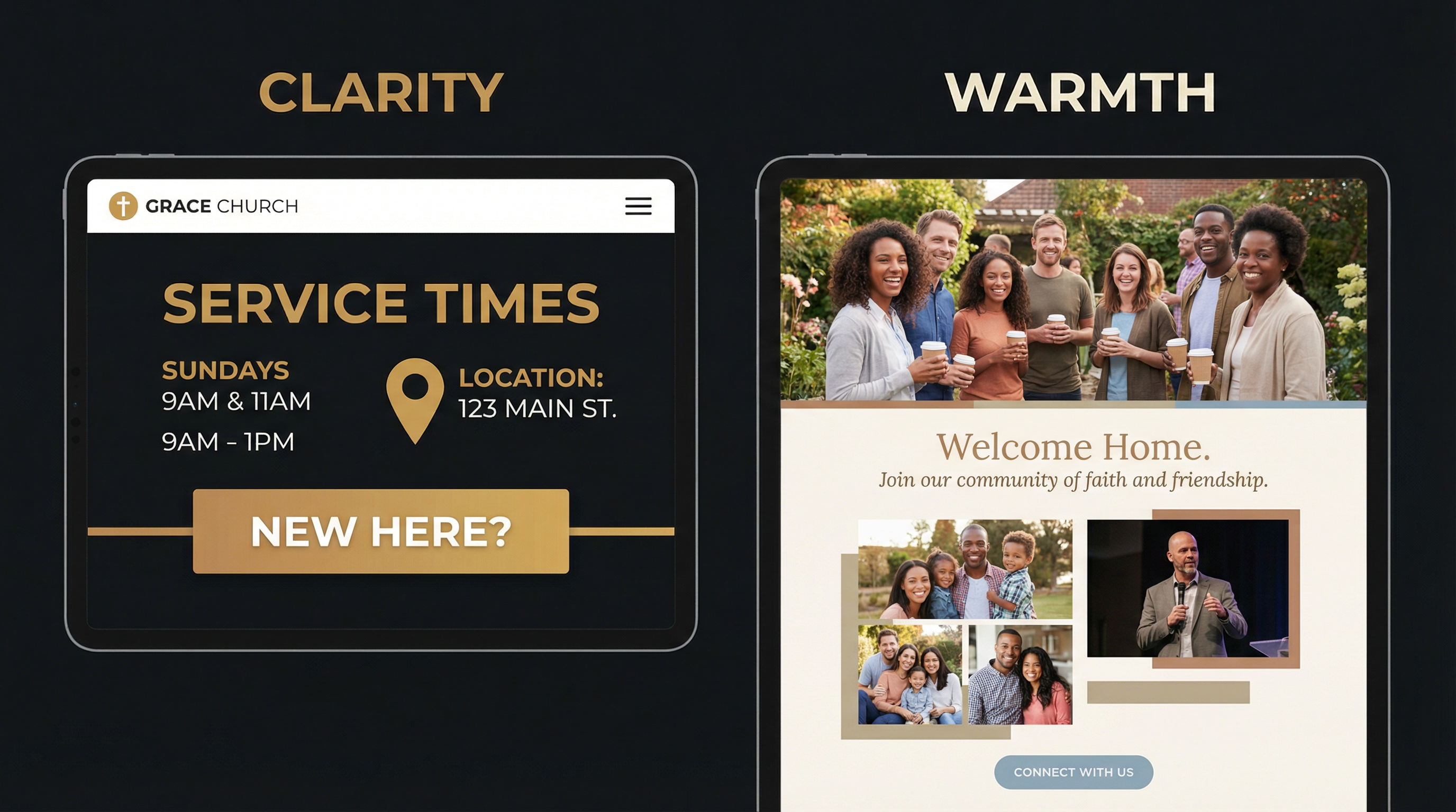
Great church websites balance clarity (instant answers to practical questions) with warmth (pastoral copy that shepherds nervous visitors).
Want a website that nails both clarity AND warmth? Fast Church Websites builds custom church sites in 48 hours—no DIY struggle, no generic templates. See our pricing → [blocked]
15 Church Websites That Get It Right
Now let's look at 15 real examples. Each one excels in different areas—some nail mobile design, others have exceptional "Plan Your Visit" content, and a few demonstrate how to serve both guests and members seamlessly. Pay attention to what resonates with your church's context and adapt these principles to fit your unique mission.
1. Live Oak Community Church (Lubbock, TX)
What Makes It Work: Live Oak's site is built around one simple idea—help people take their next step. Navigation, copy, and structure all support that goal.
Key Features:
- Instant clarity for guests: Service times, location, and "New Here" content are visible without scrolling. A first-time visitor doesn't have to hunt for the basics.
- Age-specific ministry pages: Parents and students can see exactly what to expect, where to go, and how to get involved. This lowers anxiety for families visiting with kids.
- Connected ecosystem: Sermons, events, giving, and the mobile app are tied together so people can engage from anywhere.
Lesson for Your Church: Design your homepage so a new person can answer "When do you meet? Where are you? What happens with my kids?" in under 30 seconds. Everything else is secondary.
2. First Methodist Church (Carlsbad, NM)
What Makes It Work: First Methodist's site feels like a personal invitation, not a bulletin board. The tone is pastoral and hopeful, but the layout stays clean and modern.
Key Features:
- "Plan Your Visit" that actually pastors people: Parking, what to wear, kids' environments, and service styles are clearly explained in friendly language. This is shepherding, not just informing.
- Service options explained, not dumped: Multiple services and formats are framed in a way that helps guests choose what fits them best, rather than overwhelming them with a list.
- Events and calendar that feel alive: The site functions as a current hub for what's happening, not a static list of ministries.
Lesson for Your Church: Use your site copy to shepherd, not just inform. Write like you're talking to someone who's nervous about visiting church for the first time. Address their real questions and anxieties with warmth and specificity.
3. Engage Church
What Makes It Work: Engage's site makes a big promise to real people with real stories: "No matter where you are, or where you've been, you can ENGAGE here." The content backs that up.
Key Features:
- Plainspoken, honest welcome: "What to Expect" answers the actual questions people have about service length, worship style, and atmosphere—in normal, everyday language.
- Visible heart for diverse communities: Spanish-language ministry and multicultural awareness are clearly presented, signaling who they're intentionally trying to reach.
- Clear next steps beyond Sunday: Groups, serving, and connection points are obvious and action-oriented.
Lesson for Your Church: Don't be afraid to say who your church is for and how you're ready to welcome people with messy stories. Authenticity beats polish when it comes to connecting with unchurched visitors.
4. Holy Trinity Edmond
Mission: "Love God. Love One Another. Love Your Neighbor."
What Makes It Work: Holy Trinity's website is rooted and warm. It showcases a clear identity without feeling rigid or insider-only.
Key Features:
- Mission woven into the site, not hidden on one page: Their "Love God / Love One Another / Love Neighbor" framework shows up in navigation and content, not just in a single paragraph on the About page.
- Sunday morning spelled out: Service times, worship style, and what a typical Sunday looks like are laid out with enough detail to calm nerves.
- Family-friendly clarity: Kids and student ministry info is accessible and practical—where to go, safety protocols, and age-appropriate discipleship.
Lesson for Your Church: Let your theological and missional center of gravity shape your site structure and headings, not just your "About" page. If your mission is central to your church, it should be central to your website.
5. The Way LBK
Mission: "The Way LBK is a Christ-centered family of GRACE where all persons are welcome and wanted."
What Makes It Work: The Way LBK shows how to combine modern design with old-school hospitality.
Key Features:
- Guest experience that feels like a warm handshake: Their "What to Expect" content talks about greeters, coffee and donuts in the Holy Grounds Café, modern worship, and—crucially—no awkward "stand up and introduce yourself" moments.
- Simple, repeated Sunday clarity: "Discussion 9:30am | Worship 10:30am" and a clear LIVE STREAM time make it easy for both in-person and online attenders.
- Real discipleship pathways: Kids, youth, adults, and missions each have clear next steps. The site doesn't just welcome people—it shows them how to grow.
- Mobile app integration: Their app is featured as a way to stay up to date, listen to sermons, manage signups, and give.
Lesson for Your Church: Treat your website like your lobby—show people what it will feel like to be there, not just what time to arrive. Describe the sensory details (coffee, music, greeters) that help visitors visualize their first Sunday.
6. First Baptist Durango
Mission: "Love God. Love People. Make Disciples."
What Makes It Work: First Baptist Durango uses their website as a ministry backbone, not just a digital sign.
Key Features:
- Mission-first homepage: "Love God. Love People. Make Disciples." sits front and center, with immediate CTAs to "NEW HERE?", "Who We Are", "SERMONS", and "Events".
- A clear framework: Gospel, Community, Word, Mission explained in language that's both accessible and doctrinally grounded.
- Digital bulletin + robust resources: A Digital Bulletin links Sunday to weekday life. Resources like sermons, gospel communities, membership, benevolence information, and RightNow Media make the site genuinely useful.
- Leadership bios with real testimonies: Elder and staff stories give newcomers a sense of who's leading and how God has worked in their lives.
Lesson for Your Church: A strong church website serves both guests and members—welcoming new people in while resourcing your existing congregation. Don't choose one audience over the other; design for both.
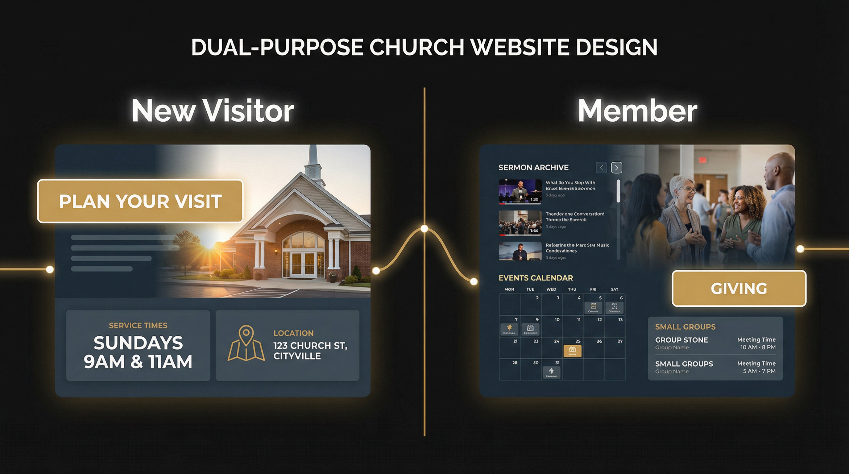
The best church websites serve two distinct audiences: new visitors need clarity and welcome, while existing members need resources and next steps.
Tired of choosing between DIY platforms and expensive agencies? We build professional church websites in 48 hours for $97-$997 (including FREE hosting). Get started today → [blocked]
7. Bay Area Christian Church (San Francisco, CA)
Tagline: "Love God, love doing good."
What Makes It Work: Bay Area Christian Church operates six locations across the San Francisco area, and their website makes multi-site navigation seamless.
Key Features:
- Multi-location clarity: Each location has its own page with service times, directions, and campus-specific information, but the overall site maintains a unified brand.
- "Come as you are" approach: The site explicitly welcomes a wide variety of individuals, signaling inclusivity without compromising theological clarity.
- Clear navigation: Locations, events, resources, and giving are all one click away from the homepage.
Lesson for Your Church: If you're a multi-site church, don't bury location-specific information. Make it easy for visitors to find their nearest campus and see what makes each location unique.
8. Canyon Ridge Christian Church
What Makes It Work: Canyon Ridge's website uses high-quality images to showcase vibrant community life, making the church feel alive and welcoming.
Key Features:
- Welcoming design: The homepage features real people from the congregation—diverse ages, ethnicities, and life stages—creating an immediate sense of belonging.
- Easy-to-find essentials: Beliefs, ministries, and service times are accessible from the main navigation without digging through subpages.
- Community outreach emphasis: The site highlights how the church serves the local community, not just its own members. For more details, see our essential church website pages [blocked].
Lesson for Your Church: Use real photos of your congregation, not stock images. Let visitors see the diversity, joy, and authenticity of your church family before they ever walk through the door.
9. Austin Stone Community Church (Austin, TX)
Platform: Webflow
What Makes It Work: Austin Stone's website is a masterclass in visual storytelling and simplicity. The design feels contemporary without being trendy, and the content is organized for easy discovery.
Key Features:
- Muted colors and generous white space: The site uses a calming palette that doesn't compete with the content. Large, high-quality images draw you in without overwhelming.
- Bold yet understated typography: Headings are clear and readable, enhancing usability without sacrificing style.
- Organized grid layout: Sermons and events are displayed in a clean grid, making it easy to browse recent content.
- Comprehensive programs: Austin Stone Counseling and Austin Stone Creative are featured prominently, showing how the church serves beyond Sunday services.
Lesson for Your Church: Balance functionality and style. A beautiful website means nothing if visitors can't find what they need. Prioritize usability first, then layer in visual appeal.
10. Renew Church OC (Orange County, CA)
Tagline: "Imperfect people only"
What Makes It Work: Renew Church OC's design reflects its mission—creating a safe, non-judgmental space for people who feel like they don't fit the "church mold."
Key Features:
- Modern and friendly design: Simple fonts, round images, and an off-white and black color scheme create a welcoming vibe.
- Diversity focus: The site explicitly welcomes all people and highlights the church's commitment to foster care and tackling tough conversations.
- Mission-driven messaging: "Imperfect people only" isn't just a tagline—it's woven throughout the copy, navigation, and imagery.
Lesson for Your Church: Let your design reflect your mission. If your church is for "imperfect people," your website should feel approachable, not polished to the point of intimidation.
11. Knox Toronto
What Makes It Work: Knox Toronto keeps it simple. The site focuses on the core message—believing in Jesus Christ—and welcomes diversity without overcomplicating the user experience.
Key Features:
- Simplicity in messaging: The homepage clearly states what the church believes and who they welcome, without jargon or insider language.
- Clean, modern design: The layout is uncluttered, making it easy to find service times, location, and next steps.
- Focus on life change: The site emphasizes how the church helps people grow, not just what programs are available.
Lesson for Your Church: Sometimes less is more. If your message is clear and your mission is compelling, you don't need flashy design or complex navigation. Simplicity can be powerful.
12. Anchor Church (Tacoma, WA)
Platform: Webflow
What Makes It Work: Anchor Church's website is a study in minimalism. The monochromatic color scheme, bold typography, and large images create a seamless experience that's both visually appealing and highly functional.
Key Features:
- Clean, minimalist design: The site uses a black, white, and gray palette with pops of color only for CTAs, keeping the focus on content.
- Three locations clearly organized: Central, Lincoln, and Lakewood campuses each have dedicated pages with service times and directions.
- Programs for all ages: Kids, students, and support programs like Celebrate Recovery are easy to find and understand.
- Interactive elements: Hover effects and smooth transitions enhance the user experience without being distracting.
Lesson for Your Church: Minimalism doesn't mean boring. A restrained color palette and clean typography can create a professional, modern look that lets your content shine.
13. VOUS Church (Miami, FL)
Platform: Webflow
What Makes It Work: VOUS Church's website is a perfect example of dual-purpose design. It serves both new visitors and existing members without creating confusion.
Key Features:
- Modern black-and-white color scheme: The site feels contemporary and professional, with bold typography and high-quality imagery.
- Prominently featured new visitor info: Service times, location, and "What to Expect" are front and center for first-timers.
- Organized member content: Sermon archives, community groups, and giving are clearly separated so existing members can find what they need quickly.
- Clear call-to-action buttons: Every section has a next step, guiding users toward engagement.
Lesson for Your Church: You don't have to choose between serving guests and members. Use clear sections, intuitive navigation, and strategic CTAs to serve both audiences on the same site.
14. Passion City Church (Atlanta, GA & Washington, D.C.)
Platform: WordPress
What Makes It Work: Passion City Church's website emphasizes visual storytelling and dynamic content. The design feels alive, reflecting the energy of the church's worship and community.
Key Features:
- Balanced color palette: The site uses warm, inviting colors that create a sense of community without feeling overly designed.
- Minimalist layout with intuitive navigation: Despite having multiple locations and programs, the site never feels cluttered.
- Programs for all ages: Kids, students, and young adults each have dedicated sections with clear next steps.
- Dynamic content: The homepage features recent sermons, upcoming events, and live-streamed services, keeping the site fresh and current.
Lesson for Your Church: Your website should feel alive, not static. Regularly update your homepage with recent sermons, upcoming events, and fresh content to show that your church is active and engaged.
15. Bridgetown Church (Portland, OR)
Platform: Squarespace
What Makes It Work: Bridgetown Church's website uses bold visuals and large image banners to create an emotional connection before visitors even read the copy.
Key Features:
- Bold, modern design: The black-and-white color scheme with high-quality images creates a contemporary, artistic feel.
- Large image banners: The homepage showcases the church's community and mission through full-width images that immediately draw you in.
- Comprehensive programs: Community groups, prayer rooms, recovery communities, and discipleship courses are all clearly presented.
- Visual storytelling: The site uses images to tell the story of the church's mission and values, not just text.
Lesson for Your Church: Let your images do the talking. High-quality, authentic photos of your congregation in worship, community, and service can communicate your church's heart better than paragraphs of copy.

Most church searches happen on mobile devices. Your site must load fast, display clearly on small screens, and make it easy to get directions or call with one tap.
Comparison: Design Platforms & Styles
The 15 churches above use a variety of website platforms and design approaches. Here's how they break down:
| Platform | Churches Using It | Strengths | Best For |
|---|---|---|---|
| Squarespace | 7 (Renew OC, Knox Toronto, Bridgetown, etc.) | Modern templates, easy to use, mobile-responsive | Small to mid-size churches with limited tech resources |
| WordPress | 3 (Bay Area Christian, Passion City, etc.) | Flexibility, customization, plugin ecosystem | Churches with technical staff or budget for developers |
| Webflow | 3 (Austin Stone, Anchor, VOUS) | Design control + CMS, no coding required | Churches prioritizing custom design and brand identity |
| GoDaddy/Weebly | 2 (smaller churches) | Budget-friendly, simple setup | Very small churches or church plants |
Design Style Breakdown
| Style | Examples | Key Characteristics | When to Use |
|---|---|---|---|
| Modern/Minimalist | Anchor, VOUS, Austin Stone | Clean lines, monochromatic colors, generous white space | Contemporary churches, urban contexts, younger demographics |
| Warm/Traditional | First Methodist, Holy Trinity | Soft colors, traditional fonts, pastoral tone | Established churches, traditional denominations, family-focused |
| Bold/Visual | Bridgetown, Passion City | Large images, bold typography, emotional storytelling | Creative churches, artistic communities, mission-driven focus |
| Colorful/Welcoming | Renew OC, Engage | Bright colors, friendly fonts, diverse imagery | Churches emphasizing inclusivity, diversity, and non-judgment |
Essential Features Every Church Website Needs
Based on the 15 examples above, here are the non-negotiable features your church website must include:
For New Visitors
- Service Times & Location (above the fold, no scrolling required)
- "New Here" or "Plan Your Visit" Section (parking, dress code, what to expect)
- Kids' Ministry Information (safety, age groups, check-in process)
- Beliefs/Mission Statement (who you are, what you believe)
- Contact Information (phone, email, map with one-click directions)
For Existing Members
- Sermon Archive (recent messages, searchable by topic/speaker/date)
- Event Calendar (upcoming events, registration links)
- Small Groups/Ministries (how to get involved beyond Sunday)
- Online Giving (secure, mobile-friendly, multiple payment options)
- Mobile App (if available, prominently featured)
Technical Essentials
- Mobile-Responsive Design (looks good on phones, tablets, desktops)
- Fast Load Times (under 3 seconds on mobile)
- Clear Navigation (no more than 7 main menu items)
- Search Functionality (especially for sermon archives and blog content)
- SSL Certificate (secure connection, especially for giving pages)
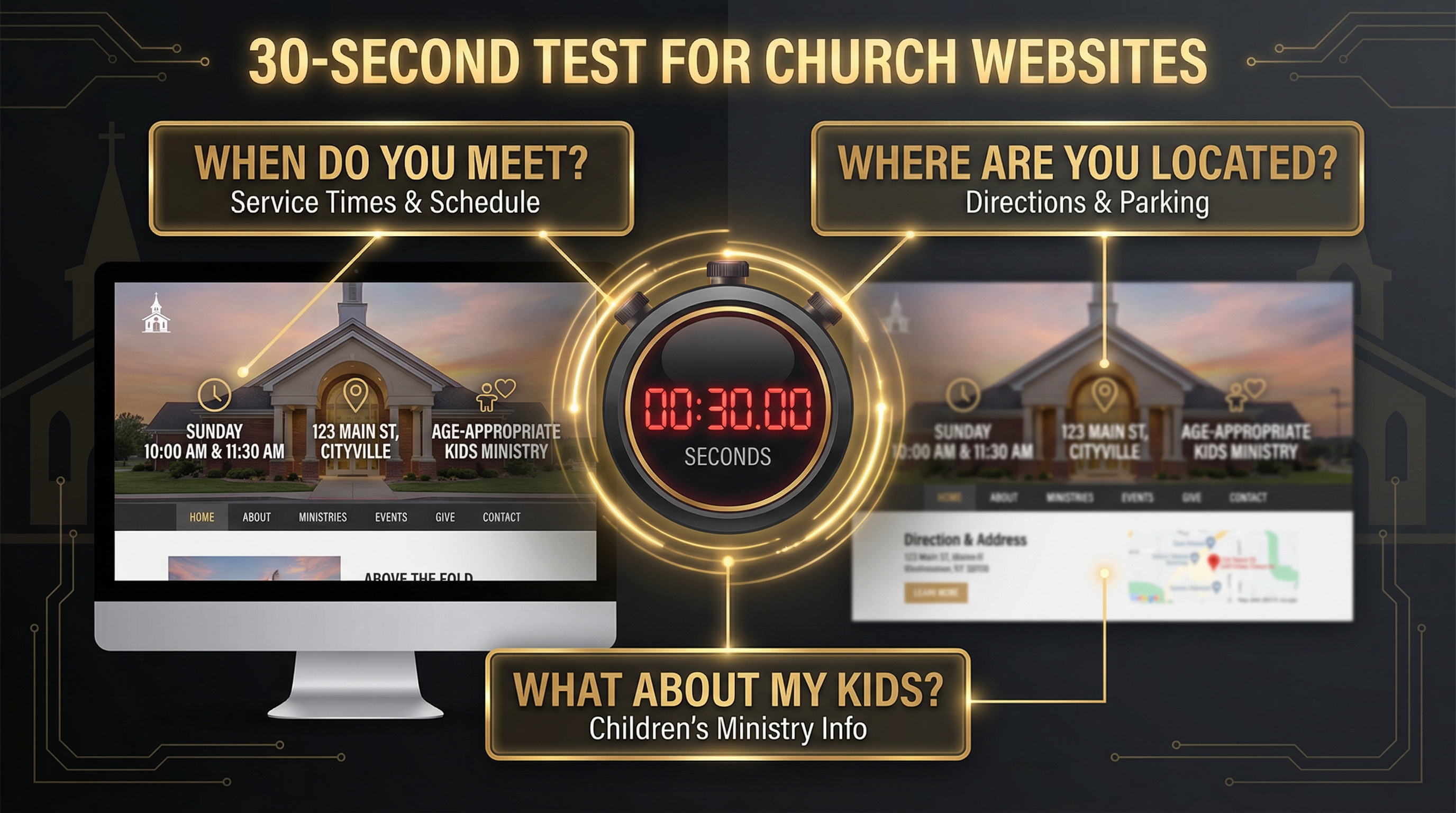
Can a first-time visitor answer these three questions in under 30 seconds? If not, your homepage needs work.
Frequently Asked Questions
How much does a good church website cost?
The cost varies widely depending on your approach. A DIY website using Squarespace or WordPress templates can cost $200-500/year (domain, hosting, premium theme). A custom-designed site built by a professional agency typically ranges from $3,000-10,000+ depending on complexity, features, and ongoing maintenance. Many churches find success with a middle-ground approach: using a platform like Webflow or WordPress with a pre-built church theme, then customizing it to fit their brand.
Do I need a professional designer, or can I build it myself?
It depends on your technical comfort level and available time. Platforms like Squarespace and Wix are designed for non-technical users and offer beautiful church-specific templates. If you have basic computer skills and can dedicate 10-20 hours to learning the platform, you can build a solid site yourself. However, if you want custom features (like sermon archives, event registration, or giving integration), hiring a designer or developer can save you significant time and frustration.
How often should I update my church website?
At minimum, update your homepage weekly with recent sermons, upcoming events, and current announcements. Your event calendar should be updated as soon as new events are scheduled. Sermon archives should be uploaded within 24-48 hours of each service. Blog content (if you have it) should be added at least monthly. The more current your site feels, the more visitors will trust that your church is active and engaged.
What's the most important page on a church website?
The homepage is the most important page because it's where 80% of first-time visitors land. It must pass the 30-second test: Can a new visitor find service times, location, and kids' ministry info without scrolling or clicking? After the homepage, the "Plan Your Visit" or "New Here" page is critical—this is where you pastor nervous first-timers through the decision to attend.
Should I include a blog on my church website?
A blog can be valuable if you have someone committed to writing regularly (at least 2-4 posts per month). Blog content helps with SEO, establishes your church's voice on important topics, and provides resources for members. However, an abandoned blog with the last post from 2022 sends a worse message than no blog at all. Only add a blog if you can maintain it consistently.
How do I make my church website mobile-friendly?
Most modern website platforms (Squarespace, WordPress, Webflow) automatically create mobile-responsive designs. Test your site on multiple devices (iPhone, Android, tablet) to ensure text is readable, buttons are tappable, and images load quickly. Pay special attention to your homepage—service times, location, and the "New Here" button should be visible without scrolling on a phone screen.
What about online giving—should it be on my website?
Absolutely. Online giving is no longer optional—it's expected. According to recent studies, churches with online giving options see 32% higher overall giving than those without. Integrate a secure giving platform (like Tithe.ly, Pushpay, or Subsplash) directly into your website. Make the "Give" button prominent in your main navigation, and ensure the giving page works seamlessly on mobile devices.
How do I choose between Squarespace, WordPress, and Webflow?
Choose Squarespace if you want beautiful templates, easy setup, and minimal technical complexity. Best for small to mid-size churches with limited tech resources.
Choose WordPress if you need maximum flexibility, a large plugin ecosystem, and don't mind a steeper learning curve. Best for churches with technical staff or budget for developers.
Choose Webflow if you want design control without coding, a powerful CMS, and a modern workflow. Best for churches prioritizing custom design and brand identity.
Can I use stock photos, or do I need real photos of my church?
Real photos of your congregation are always better than stock images. Visitors want to see what your church actually looks like—the diversity of your community, the atmosphere of your worship, the energy of your kids' ministry. If you don't have high-quality photos, invest in a one-time photoshoot with a professional photographer. The authenticity will pay dividends in visitor trust and engagement.
How do I measure if my church website is working?
Track these key metrics using Google Analytics (free):
- Bounce rate: Are visitors leaving immediately, or exploring multiple pages?
- Time on site: Are people reading your content, or just skimming?
- Top pages: Which pages get the most traffic? (Homepage, sermons, events?)
- Mobile vs desktop: What percentage of visitors are on phones?
- Conversion rate: How many visitors click "Plan Your Visit" or "Give"?
Most importantly, ask first-time visitors: "Did our website help you decide to visit?" Their feedback is more valuable than any analytics dashboard.
Your Next Steps: Building a Website That Works
You've seen 15 real examples of church websites that balance clarity and warmth, serve both guests and members, and reflect their unique mission and values. Now it's time to apply these principles to your own church.
Here's your action plan:
Step 1: Audit Your Current Site (30 minutes)
Pull up your church website on your phone and set a timer for 30 seconds. Can you answer these three questions without scrolling or clicking?
- When do you meet?
- Where are you located?
- What happens with my kids?
If not, your homepage needs immediate work. Service times, location, and a "New Here" button should be visible above the fold.
Step 2: Choose Your Platform (1-2 hours)
Based on the comparison table above, decide which platform fits your church's technical capacity and budget. If you're starting from scratch, Squarespace is the easiest path to a professional site. If you need custom features or have technical staff, WordPress or Webflow offer more flexibility.
Step 3: Write Your "Plan Your Visit" Page (2-3 hours)
This is the most important page after your homepage. Answer these questions in warm, pastoral language:
- What time are services, and how long do they last?
- Where do I park, and where do I enter the building?
- What's the dress code? (Spoiler: "Come as you are" is always the right answer.)
- What's the worship style? (Contemporary? Traditional? Blended?)
- What happens with my kids? (Age groups, check-in process, safety measures)
- Will I have to stand up and introduce myself? (Please say no.)
Step 4: Gather Real Photos (ongoing)
Stock photos scream "we don't care enough to show you our actual church." Hire a photographer for a one-time photoshoot, or recruit a volunteer with a decent camera to capture worship, community, kids' ministry, and small groups in action. Use these images throughout your site.
Step 5: Test with Real People (1 week)
Before you launch (or relaunch), ask 3-5 people who've never visited your church to browse your site and answer:
- Would you feel welcome here?
- Can you find service times, location, and kids' info easily?
- Is there anything confusing or off-putting?
Their feedback will reveal blind spots you can't see as an insider.
Ready to Build a Church Website That Actually Works?
Your church website is the first impression for 82% of your visitors. It's the difference between someone showing up on Sunday or hitting the back button and trying the next church on the list. The 15 examples in this guide prove that you don't need a massive budget or a professional design team—you just need clarity, warmth, and a commitment to serving both guests and members well.
If you're ready to build a website that passes the 30-second test, reflects your mission, and helps people take their next step toward your church, we can help. Fast Church Websites specializes in building beautiful, functional church websites in 48 hours—no templates, no generic designs, just a custom site that fits your unique mission and community.
Get Your Custom Church Website in 48 Hours → [blocked]
Written by Manus AI | Last Updated: February 11, 2026